Page 1 of 1
Showing trends via graphs
Posted: Tue Jul 30, 2019 11:50 am
by WR7
Hello,
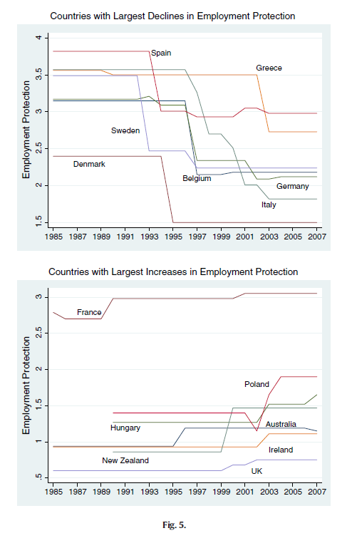
Is it possible to show trends such as in the image blow via the graphing function?
Re: Showing trends via graphs
Posted: Tue Jul 30, 2019 11:56 am
by EViews Gareth
Those just look like line graphs - one for each country. So, sure?
Re: Showing trends via graphs
Posted: Tue Jul 30, 2019 12:12 pm
by WR7
I have panel data with 30 countries over 16 years.
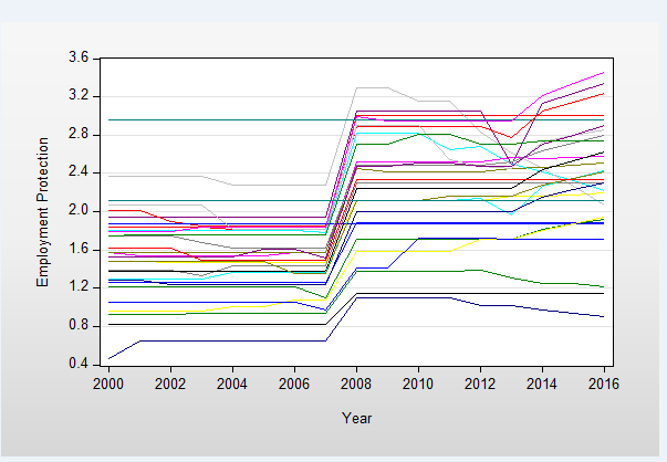
I managed to get all the countries on one XY scatter graph
but how would I specifically pick the ones (5 countries for example) which have the largest increase and place that on one single graph and vice versa for largest decrease
Re: Showing trends via graphs
Posted: Tue Jul 30, 2019 12:36 pm
by EViews Gareth
Define a measure of "largest increase", then set the sample to be the countries who are higher than that measure.