
I have generated a forecast series and two series confidence intervals in Eviews (time series). Now I would like to plot a line graph for the forecast, and the confidence intervals as a shaded area in the same graph. I would like something that looks like this:
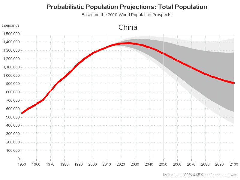
I tried first creating an area band plot from the confidence interval series and then group it with the line plot from the forecast series, but then everything becomes lines.
Any pointers on how to achieve this would be appreciated.