Showing trends via graphs

For questions regarding the import, export and manipulation of data in EViews, including graphing and basic statistics.

Moderators: EViews Gareth, EViews Jason, EViews Steve, EViews Moderator

WR7
Posts: 2
Joined: Tue Jul 30, 2019 10:29 am

Showing trends via graphs

Postby WR7 » Tue Jul 30, 2019 11:50 am

Hello,

Is it possible to show trends such as in the image blow via the graphing function?

Image

EViews Gareth
Fe ddaethom, fe welon, fe amcangyfrifon
Posts: 13317
Joined: Tue Sep 16, 2008 5:38 pm

Re: Showing trends via graphs

Postby EViews Gareth » Tue Jul 30, 2019 11:56 am

Those just look like line graphs - one for each country. So, sure?
Follow us on Twitter @IHSEViews

WR7
Posts: 2
Joined: Tue Jul 30, 2019 10:29 am

Re: Showing trends via graphs

Postby WR7 » Tue Jul 30, 2019 12:12 pm

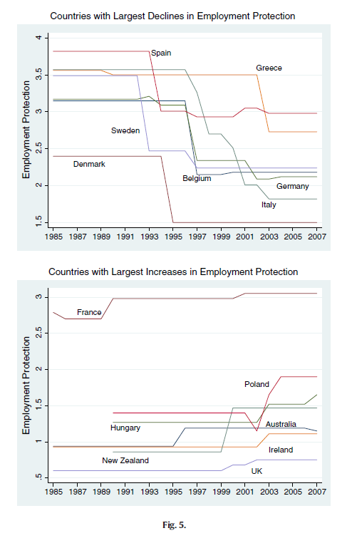
I have panel data with 30 countries over 16 years.

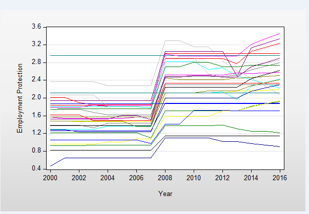
I managed to get all the countries on one XY scatter graph

Image

but how would I specifically pick the ones (5 countries for example) which have the largest increase and place that on one single graph and vice versa for largest decrease

EViews Gareth
Fe ddaethom, fe welon, fe amcangyfrifon
Posts: 13317
Joined: Tue Sep 16, 2008 5:38 pm

Re: Showing trends via graphs

Postby EViews Gareth » Tue Jul 30, 2019 12:36 pm

Define a measure of "largest increase", then set the sample to be the countries who are higher than that measure.
Follow us on Twitter @IHSEViews


Return to “Data Manipulation”

Who is online

Users browsing this forum: No registered users and 22 guests